Turning transit data into music using audiolization
07 Nov 2017Data visualization is all the rage these days. In my attempt to jump on this fruitful bandwagon I began exploring using transitland, a super-awesome open-source tool that’s aggregating transit data from agencies around the world and enabling some pretty neat stuff! (seriously, check them out) Anyway, I created a cool visualization of the TTC, everyone’s beloved (read: love to hate) public-transit agency in Toronto. At the end I had this awesome looking video with pure silence in the background. That’s when I thought… “Hey, I’m going to start a metal band” (my dream) and “we’re gonna play some awesome backing music!”. Then I thought, “wait! what if we can do even better, and represent the data with sound or music?”. Hmmm….
Visualizing data: a demonstration using transitland-processing animation
I orginally set out to simply follow the easy-as-pie steps of the transitland-processing-animation and end up with a pretty animation of the TTC. For which I ran the following command to parse data from a single day (Oct 23/2017).
python transitflow.py --name=bart --operator=o-dpz8-ttc --date=2017-10-23
This took many hours to download. Not sure if my internet is painfully slow or if there is a time-limit to the API calls (probable). Nonetheless, as they say, patience is a virtue. The strange looking code after the --operator is simply the OneStop-ID of the TTC which you can read all about here. Special thanks to the City of Toronto for their OpenData initiative (keep it up!)
So after this, I ran the sketch.pde that is created by the transitland-processing-animation and ran the sketch. I ended up with a video for all TTC vehicles on October 23/2017. Pretty cool eh!? But it was a silent film. It’s 2017, and from what I understand silent films went out of vogue about ~80 years ago. Alas, we needed sound.
Audiolizing data: a demonstration using my transitland-matlab-audiolizer
When I was convinced that I had neither the means nor talents to start a heavy metal band and begin rocking on my nicely polished Rich Warlock, I decided to make music with the world’s next best musical instrument… Matlab. Yes, you read that right.
So, I made a fairly simple Matlab program to take the counts of all the transit vehicles created by transitland and combined it with the animation to create this result.
“Wow that sounds weird” you say? Exactly. But it’s a cool-weird audiolization of data (atleast I think so!). Now not only are you looking at the data you’re also hearing it as well. As the transit usage increases during morning and evening rushhour you’ll hear corresponding changes to the sound.
How it works?
I was inspired by a pulse oximetry project I’d done in the past and submitted to the Canadian Anesthesiologists’ Society conference in June. If you’re interested you can look at the submission here. It’s not really worth the read but to sum it up we were taking a clinical pulse oximeter system and developing a device to allow it to be interfaced with GarageBand. In the end, we could make “music” from your heart rate (beats/minute) and partial pressure of oxygen in your blood! (that is how well oxygenated your blood is)… It’s the next big thing in indie music, I know it.
In that project, the beats/minute controlled the tempo of the music and the partial pressure of oxygen controlled the pitch. Here, atleast with the TTC, we have three modalities of transit: buses, streetcars, and subways. Transitland allows us to download .csv (essentially spreadsheets) which document how many of each transit vehicle there are a any given point in a given day.
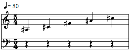
First, I downsampled the original transit count arrays from 3600 to 60 datapoints to make things more manageable and so that I could deal with each second of the minute long video. With this, I wrote Matlab code to translate the number of subways into the pitch, the number of buses into the tempo, and the number of streetcars into the volume. For the pitch, and tempo I used the datapoint z-score to assign a discreete value based on the number of subways and buses respectively. Using the z-score means that if a given subway count data point (that is, the number of subways at a given point in the day) has a z-score of > 1.0 (i.e. in in the ~15th percitle) it will cause a noticeable change in the pitch. These are the notes I used for the pitch:
Fun fact, the last three notes are actually the chime of the TTC! When the number of subways is decreasing after rush hour you should be able to hear the iconic C#5, A#4, F#4.
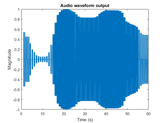
Same is true for the number of buses and tempo. For volume, I used a continous change based on the number of streetcars at a given point in time. Running the program I got the following graph of the audio output:

(Notice, how it follows the graph from the visualization video! That’s a good sign.)
Then I put the visualization I created using the transitland-processing-animation together with the audio output and ta-da! I got the video you saw above.
Why oh why?
This could be a good way to help city planners convey transit data and use these kinds of visualization/audiolization techniques to inform evidence-based (I’m looking at you Scarborough subway extension) transit planning.
Want to try it yourself? No problem! I’ve open-sourced the project and put it on Github. Feel free to contribute to it or fork away.
